Website Design Mistakes Businesses must avoid
Irrespective of your business size or sector, having a website is vital. Consumers and customers use websites to verify a business, obtain contact information, and research the items or services they are interested in. It’s a difficult decision to create your website or pay a professional to construct one for your business. Here are the most common website design mistakes made by businesses.
On this page:
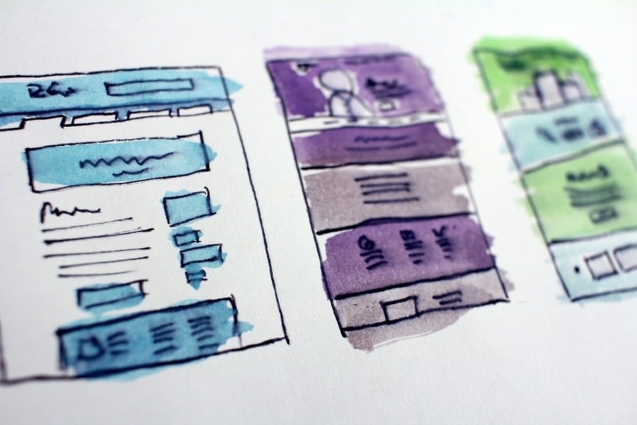
Poor Design & Layout
Poor design and layout are typical website design mistakes that many businesses make. A poorly designed website that is not user-centric makes it difficult for users to complete the task at hand, such as learning about your product, subscribing to a newsletter, making a purchase, or other tasks.
RELATED: Thriving as an Ecommerce Store: Improving User Experience (UX) for your Website
In contrast, well-designed websites focus on the user. User-centric websites make it simple for users to navigate and find the information they are seeking.
A website’s primary objective is to generate leads and create sales. Complicated or difficult-to-navigate websites will result in visitors bouncing or abandoning their carts before completing their transactions.
Websites with poor design and layouts may demonstrate accessibility issues due to insufficient colour contrast. The user may feel overwhelmed by options due to a cluttered layout or a lack of visual hierarchy.
RELATED: ECommerce Branding: Steps for Growing and Scaling your Ecommerce Brand
Here are 5 tips to improve the design and layout of your website:
- Keep your homepage minimal and clutter-free – Your website’s homepage should convey your primary message immediately. Users swiftly scan the page for essential words, phrases, and visuals. With these established tendencies in mind, it is preferable to appeal to emotions than word count.
- Colors – Aim to use between 3 and 7 different colours in your design
- Typefaces: Use legible typefaces, making sure text color contrasts with the background color
- Graphics: Use visuals to assist a user in completing a task or performing a specified function
- Design with a visual hierarchy in mind – Hierarchy is a crucial design idea that aids in presenting your material clearly and effectively. if you apply hierarchy correctly, you’ll be able to direct site users’ attention to specific page pieces in order of priority, beginning with the most important piece
- Ensure your site is easy to navigate – You want your users to be able to find what they’re looking for with ease. Furthermore, a site with good navigation aids search engines in indexing your information while also enhancing the user experience
- Keep your interface consistent – One of the essential UX concepts is to keep the interface consistent throughout. Your website’s general appearance and feel should be uniform throughout its pages. The consistency of navigation, colour schemes, typefaces, and writing style can all improve usability and UX.
- Use a descriptive, keyphrase-focused headline – The headline at the top of your homepage, and each subsequent page, is either descriptive or not. If not, the visitor may query if they are at the right place. It’s also a chance to employ target keywords and show relevance. Make it a point to explain what the company does near the top of the page.
Lack of Quality Content
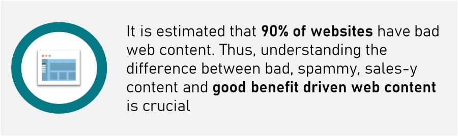
A well-designed website is composed of several components. One of those is high-quality site content which is an area where many businesses falter.
Without a range of visual interests, the content may become overwhelming for website visitors. A common website design mistake made by businesses is to include way too much material in cascading paragraphs.
On the other hand, stacking an excessive number of photographs in monotonous rows might produce the same aesthetic dilemma. The greatest websites have distinct visual routes that make it easier to consume the material.
Website content is often overlooked, despite being a critical aspect in determining whether or not you can close a transaction digitally. Therefore, before writing online content, conduct comprehensive research and create your website content strategy. Here are our tips for improving your website content:
- Understand Your Audience – You are not writing website text for your personal use. You’re constructing it for your intended audience. If your audience is not entertained by what you have to say, the entire objective of your endeavour is defeated.
- Show. Don’t Tell – If you’re talking about a product or service with no proof, you come across as a spammer
- Have Clear Messaging – Frequently, you will visit a website, read everything on it, and still have little idea what services or products they provide. That is a significant no-no; your website messaging should be extremely thorough, precise, and consistent. As a result, it should be quite instructive.
- Make it Benefit-driven, Not Feature-Driven – A excellent website will always include benefit-driven material. Rather than focusing on your products, you concentrate on your clients’ issues and how to solve them. Always focus on the core cause, the problem, and how your product resolves it.
- Showcase Your Brand Identity – If you want to establish a brand and are not content with being an unknown firm, you need to begin by concentrating on your brand identity. Ensure that your website reflects your business characteristics.
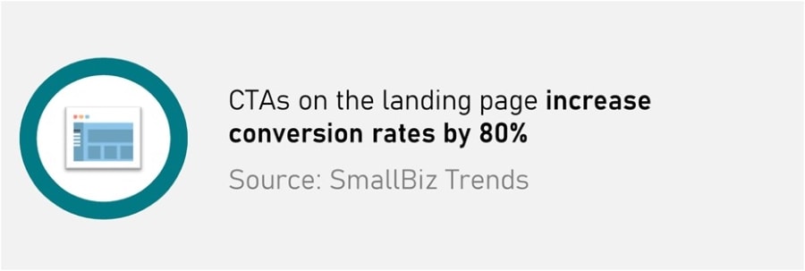
Hidden or Lack of Calls to Action
In all forms of marketing, including your website, calls to action are commonly used. Their purpose is to urge consumers to act, and as such, they are key components of your sales funnel, converting visitors to leads, prospects to customers, and customers to committed fans of your brand.
RELATED: Why eCommerce makes a perfect first business
Calls to action (CTA) are critical because they provide visitors with straightforward navigation alternatives. Users should not have to seek out navigation – the routes to their desired destinations should be obvious to follow.
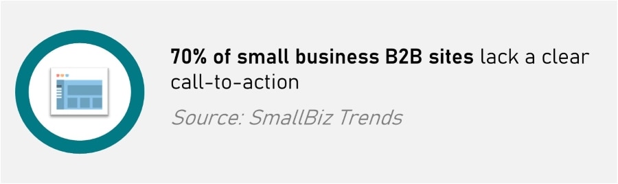
Good websites provide an excellent user experience and a clear route to action on each page and generally include at least one compelling call to action. Not having CTA, or having too few, or in the wrong place, is a typical website design mistake that many businesses can make.
These aid in guiding visitors to the pages you want them to view, regardless of which page of your website they initially land on. Whether you’re asking people to complete a form, make a contribution, or subscribe to your email list, your calls to action should persuade them to do so.
Calls to action must be purposeful and aligned with your marketing objectives. But most importantly, they must make sense to the user. Here are a few of the most frequent CTAs users may encounter:
- Learn more
- Subscribe to our blog
- Subscribe to our newsletter
- Request demo/quote
- Meet the team
- Sign up
- Get started
- Start your free trial
Before deciding where to position these calls to action on a page, you must first determine which ones go on which page.
For instance, including a call to action to subscribe to your company’s blog on your main blog page or within a blog post makes great sense.
RELATED: Conversion Rate Optimization (CRO) tips to Drive Growth
However, on your Services page, where visitors are more interested in the specifics of working with your organisation, a call to action urging them to arrange a demo or request a price might be more effective.
Calls to action (CTA) can be forms, buttons, or text and put in the sidebar, navigation, pop-up, or after posts. However, calls to action located toward the bottom of a page, particularly on the left side, may be more successful than similar prompts found higher.
Consider the activities you want your users to do, and then devise a plan for incorporating them into pages that are both obvious and relevant to the user at the moment.
Nonresponsive Website Design
A common website design mistake businesses make with their website is failing to make it responsive.
“Mobile first” is the digital industry adage that has guided online businesses in optimising their websites for the small displays of smartphones.
Although the emphasis on mobile browsing began years ago, the methods quickly adjusted to meet new consumer usability and user-friendliness criteria.
Nowadays, the industry norm is responsive or adaptive web design. Investigate the principles of responsive web design.

When a website is built utilising responsive web design, it automatically adjusts everything on the page based on a percentage-based outline. For instance, if you specify that a particular column on a page should take up 50% of the screen, the column will take up 50% of the area regardless of the screen size. This ensures that the design is consistent and user-friendly.
When using responsive web design, the same material does not necessarily show on small and big screens—mobile devices frequently cannot manage the extra content that seems clean on a laptop or desktop computer.
As previously said, “mobile-first” is frequently used as a catch-all phrase for everything online, but the true focus is the user. User-friendly websites are ranked better by search engines. Consumers like to purchase from firms with simple-to-use websites. Thus, the primary focus of a website should always be on the user experience.
Responsive web design alleviates some of the users’ frustrations with mobile surfing. Even minor difficulties, such as manually resizing a screen to accommodate a mobile device, can irritate and discourage consumers. It is more user-friendly and gives a more pleasurable experience.

Why you should avoid these Website Design Mistakes
Each website has a function, and the objective of a company website is to boost conversions, generate leads, and ultimately increase sales. The capacity of a website to improve conversions is determined by human behaviour.
The website’s design must accommodate these human actions, including advancing a transaction at the checkout step, completing a form, or making a phone contact.
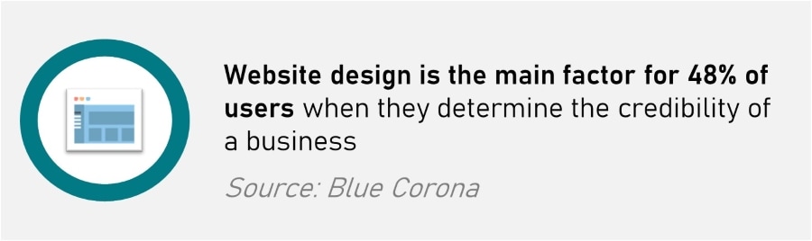
Website design is critical to the success of your website by increasing conversions. When a website designer disregards standard practices, the result might be conversions that go in the wrong way.